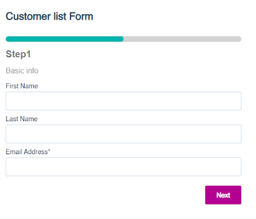
Asking your lead to fill out a long subscription form at the first stage might be annoying and lead them to leave without completing the signup process. According to a study, 81% of people abandon online forms after starting to fill out their contact information. So, what steps should be implemented to minimize your abandonment rate? Using multi-step forms can be one of the practical strategies to optimize your signup forms and improve your conversion rate; BrokerNotes, a B2C financial lead gen website, increased their conversion rate from 11% to 46% after using multi-step forms. Multi-step forms are forms that are divided into several steps, where each step may ask the lead to fill out one or multiple fields within separate views, instead of asking them to fill out all their contact details at once. By breaking down the form into small, digestible pieces, chances are your visitors might find the process less overwhelming and get more encouraged to fill it out. Using multi-step forms allows you to tap into a variety of benefits, which we will list a few of them here: As mentioned earlier, breaking down long forms into manageable steps reduces user overwhelm, making the process less daunting and more user-friendly. Gradual information collection encourages completion by maintaining user engagement throughout the form-filling process. Based on a report conducted by Formstack, a software platform that provides tools for creating online forms, multi-step forms can increase form completion rates by up to 300% compared to single-step forms. Each step can validate information, ensuring accuracy and reducing the likelihood of errors. For instance, as the form fields are minimized in each view, the visitor’s eye can better detect missing form fields or typos, helping the lead correct mistakes on the spot, as opposed to submitting a single long form with potential inaccuracies. Users are more likely to show higher intent and interest when filling out multi-step forms compared to single-step forms. This increases the probability of securing quality leads, signaling to the sales team that these leads are more engaged and potentially more valuable. By collecting essential customer data at different stages, the sales department can send more targeted follow-up actions. Compared to overwhelming single-step forms, multi-step forms are visually appealing, making the user experience more pleasant and less cluttered. Multi-step forms save space on your website, as they unfold progressively rather than presenting all fields at once, keeping the layout clean and organized. Similar to regular forms, multi-step forms can be executed for multiple use cases, such as surveys, registrations, order forms, and feedback collection. Let’s uncover in this section, the three main characteristics of creating a multi-step form: Progress indicators show users how far along they are in the form-filling process and how many steps remain. This feature helps reduce user anxiety and encourages completion by providing a clear roadmap of the form. Knowing how much progress they’ve made and what’s left to complete makes the process feel more manageable and less overwhelming.
Conditional logic reveals form fields based on previous responses, tailoring the form to the user’s specific situation. This feature creates a personalized and relevant experience for the user, reducing unnecessary questions and simplifying the form. By only showing relevant fields, it minimizes the perceived length of the form and keeps users more engaged.
Mobile responsiveness ensures that the form works seamlessly on all devices, including smartphones and tablets. Given the increasing use of mobile devices for browsing and completing forms, a mobile-responsive design is crucial for providing a positive user experience. It prevents issues such as difficult navigation, zooming, or scrolling, which can lead to form abandonment.
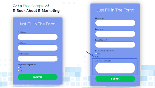
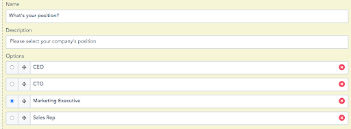
To build effective multi-step forms, you need to be aware of these practices: Besides breaking down the form into multiple, smaller chunks, adding fields that allow visitors to select from the options is an additional option to simplify the form completion process more efficiently. Examples of such fields are dropdowns, radio buttons, or multi-select fields. Desktop users will only have to press a mouse click and mobile users need to tap their selected choice and move on to the next step(s). Here’s an example: It’s important to mention that this tactic is not obligatory, but it minimizes the amount of typing and speeds up the process for visitors to complete all the required steps. Generally, every field you display should contain important information, but there are still certain fields you may find more important than others, so you can mark these questions as required for the visitor to fill out while leaving other ones as optional. This also minimizes the pressure on your leads for certain information they don’t wish to provide or find unnecessary. Especially when having several questions scattered over various steps, forcing them to answer every field is somehow annoying. For example, you may care about gathering their middle name, but this field should not be marked as required, unlike their first and last name, which should always be filled out for personalization purposes. When dividing the form into several steps, ensure that the fields in each step are compatible with each other and correspond to one category. For instance, the first step can consist of basic information (first name, last name, and email), the second step can ask for business information (company name and phone number), and the third step can conclude with personal information (date of birth and gender). Although multi-step forms present the layout in front of visitors in a more digestible way, that doesn’t mean you can show as many fields as you want within each step. This also overloads your forms and you end up making the same mistakes that you might have made when creating your single-step form. Therefore, you must emphasize collecting the most relevant information that you find suitable for your marketing objectives, and limit each step to two or three questions maximum. It’s also crucial to balance the number of steps and the length of each step. Too many steps can be frustrating, while too few might not offer the benefits of a multi-step form. Aim for a balance that minimizes friction while still collecting the necessary information. However, if you notice that there are many other fields that you haven’t displayed in this multi-step form, you can use them in other separate forms when you ask your customer to fill out their new information in the future. In the end, profiling your leads is progressive. Activate the error message that appears on top of the form each time a user makes a mistake when typing or misses a specific field. This helps the user easily correct any potential mistake and feel more in control of the process. Conclusion Multi-step forms are a great way to present questions in a way that customers can easily observe the details and reduce clutter. Make sure to understand the main characteristics of such forms and stick to the best practices of building forms that convert. Although our main focus in this article is the benefits and implementation of multi-step forms, it doesn’t mean that you should never use single forms; in some cases, a single form might be more suitable for those who prefer to visualize all information in a single view. However, the key is to avoid stuffing it with many fields; in either case, display the information you find most important to gather and monitor in your database. Ready to boost your conversion rates with multi-step forms? Start your 14-day trial today and see how easy it is to create effective forms with our step-by-step guide.What are Multi-Step Forms?
What are The Benefits of Multi-Step Forms?
Improved User Experience
Higher Conversion Rates
Better Data Quality
Quality Lead Generation
Visual Appeal
Space Efficiency
Multiple Use Cases
Key Characteristics of Effective Multi-Step Forms
Progress Indicators

Conditional Logic

Mobile Responsiveness
Best Practices for Using Multi-Step Forms
Add Clickable Elements

Mark Necessary Fields as Required
Categorize Fields Properly
Don’t Overdo It
Show an Error Message
Don’t forget to share this article

