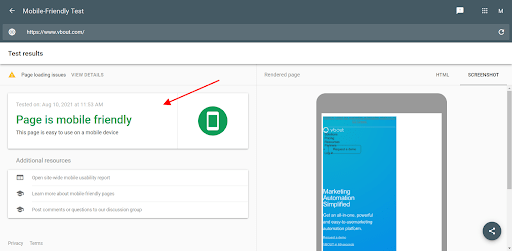
Bounce rate is one of the vital parameters in web analytics. This indicator displays the percentage of viewers who opened just one page and left. There are two explanations for why the bounce rate can be high. The first one is that people successfully gain all the needed information on the page, even though they spend unlimited time on it. The other one is that your site could use some improvement. Due to the ambiguity of this indicator, the question arises: is it worth tracking the bounce rate and somehow changing your site? It surely is worth it. After all, if the page doesn’t convert, you’re losing money. So how can you change the bounce rate for the better? Let’s look at seven possible ways to stop your visitors from leaving. What is the first thing users encounter? They open a page and wait for it to load. You may have heard that the ideal page load time is 2-3 seconds. What happens if your page takes longer to load? Usually, people won’t wait for the content to appear and will close the tab. As a result, you’ll lose the race for acquiring the buyer. Deloitte’s report proves that the primary reason for site abandonment is load latency. Besides, a slow-loading store loses 70% of consumers. So, optimize your load speed for two seconds or less and streamline transactions. Your site should be frictionless in obtaining information. People’s habits change. Buyers and website users demand more from website owners. That’s why we are witnessing an accelerated interest in headless eCommerce platforms both from shoppers and stores. If you take care of your load speed, you’ll also improve these key metrics: Here are a couple more tips. Pay attention to the Page Timings report if you see an increase in the bounce rate. Compare the statistics of your bounce rate and average page load times. At this point, you can figure out if the site’s speed causes the increased bounce rate. According to the Digital 2020 report, we use mobile phones more than half of the time on the Internet (50.1%). So, the mobile traffic spike couldn’t fly under the radar of search engines. Google was the first to pay attention to site optimization for mobile devices. It launched the Mobile-First algorithm. What does it mean for sites? That a mobile-friendly site ranks higher in search. However, the number of unoptimized websites is high. What’s holding site owners back from taking this step? Unfortunately, mobile optimization might increase a company’s expenses. It’s also not a simple undertaking from a technical standpoint. Despite this, you can’t overstate the significance of mobile optimization as it results in the following improvements: All this naturally leads to increased profits, which means that optimization costs will quickly pay off. How can you check your mobile-friendliness? There’s the Google Mobile-Friendly Test tool to help you. Let’s have a glance at the VBOUT website, which meets the needs of smartphone users. The tool also provides additional resources to track your mobile usability, learn more about mobile-friendliness, and ask questions. A large number of visitors means nothing for your conversion if you don’t target specific groups. Not to mention, they increase your bounce rate. The reason why people come to your website is to obtain some information. So give them what they need without ambiguities. Let’s say they’ve searched for “fairy tales for children”. In this case, they’re unlikely to read an article about the importance of fairy tales. Include keywords related to these inquiries to yield excellent results, such as “modern fairy tales for children” or “fairy tales for children to read aloud”. What do you get by drawing the intended audience?
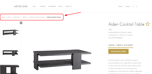
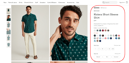
What else can a high bounce rate indicate? The fact that users couldn’t or didn’t want to browse the site. Have you checked your navigation to avoid it? Examine the current situation and determine how you can simplify it. Then simplify it one more time. Make site navigation as primitive as you can. Your visitors need to understand where they’ll get after clicking the links. Assist your customers in getting what they require quickly. Tips on improving your navigation include: Navigation should be straightforward and offer the user a seamless transition throughout the site. It’ll help lead your potential clients through the sales funnel and bring you revenue. Here is an example of breadcrumb navigation on the Arteriors product page. Making the product page perfect isn’t easy. Too much information can overload your visitors. If what you offer isn’t enough, your prospects may lack the needed facts to make an informed decision. Do you know your optimization opportunities? Spend some time to figure them out. This step will help lower not only your bounce rate but also increase your conversion rate. Of course, there can be external factors to refrain from purchase. Sometimes the reason is high prices. But more often, your potential clients refuse to make orders because your product pages miss the necessary information. For example, you don’t indicate the manufacturer, material, or anything else that your prospect cares about. Let me explain it using an example. Photos of the shirt take up most of the screen on the Bonobos product page. It helps visitors evaluate the product visually. On the right is the product description section. It’s so detailed you need to scroll down the page and open additional tabs for obtaining complete information. What can a person see on this page? Note that product pages can have slightly higher bounce rates than other types of pages. And that it may vary depending on the nature of the product or service. However, if you notice an unusually high bounce rate on your product pages, try adding more information. Before deciding whether they can trust you, purchasers scrutinize your store. They give you their confidential data, such as banking details and personal information. So, they need it to be kept safe. It gets more complicated with new clients who don’t know you yet. Can I share my credit card number? Is the store secure? The main thing in your case is to build trust. How can you persuade your leads to believe you?
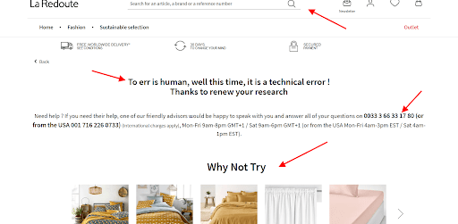
Users access your page through a unique address. But sometimes, an error can occur, and they see a typical 404 error (page not found). When does it happen? When you delete or move the page, the server can’t find any data for the client’s request. What can the first reaction of your visitors be? Right, close the tab or click the “Back” button. There is nothing else to do on such a page, so they leave. But you can think over the 404 pages to transform them into a conversion tool. There are several tactics to implement: Do you see how La Redoute uses these tips to its advantage? Examining and diminishing your bounce rate can be a daunting task. But lowering these numbers means a more engaged audience and more conversions. Evaluate your site through your visitors’ eyes. Is it fast enough? Do you cater to mobile users? Ensure seamless navigation and enhance your pages with keywords and accurate information. If you try to put all the recommendations and tips from our article into practice, you’ll be able to offer your customers the best experience. And they’ll reward you with their loyalty and purchases.
Here’s a widespread case: you’ve spent a lot of time and effort creating an eye-pleasing site, thinking through navigation and content, but still have a high bounce rate. So why do people bounce? The metric indicates whether the site meets the expectations of users who first visit it.What to tweak on your site to reduce your bounce rate
1. The page should load fast
2. Is your site mobile-friendly?
3. Targeted traffic is key
4. Look into the ways to improve navigation
5. Enhance your product pages
6. Ensure safe shopping
7. Modify your 404 page to convert
Final Words
About the author
 Alex Husar, chief technology officer at Onilab. For over 8 years he’s been working on Magento migration and development projects as well as building progressive web apps (PWAs). Alex is an expert in full-stack development who shares his expertise and in-depth knowledge on modern technologies and Computer Software Engineering.
Don’t forget to share this article

