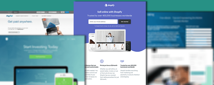
It’s happened to every marketer. After spending months crafting the perfect marketing campaign, the traction you were hoping for isn’t there. In a post-mortem, you notice a disastrous conversion rate. The truth is, your landing page wasn’t up to par– or not existent at all.
This is a mistake that beginners learn to overcome really quickly. Optimizing landing pages is critical to boost your traffic and conversions; Therefore, we will walk you through the most effective practices which will help you create landing pages that convert.
Start with an effective page headline
The page headline is the first impression that tells the potential customer that, yes, they’ve clicked the right link, and will be offered what they came for. You want those who land on this page to understand exactly who you are and what you’re offering. This way, they can determine whether you are offering a product to them that they would deem useful.
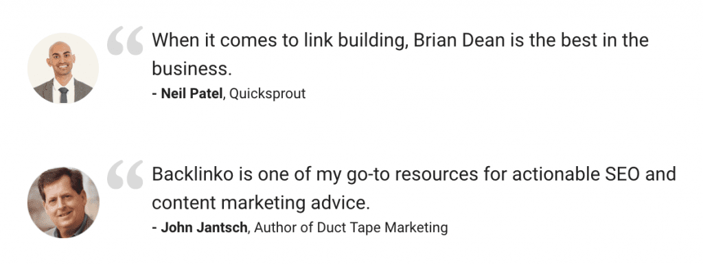
Pro tip: Start it off right with something concise yet compelling. Creative, bright, minimal design is an industry standard, along with carefully crafted copywriting. For example: some companies lead with a glowing quote from a testimonial they’ve received. In terms of design, it is ideal to start the above the fold “ATF” as high on the webpage as possible, to reduce the scroll time for the visitor.
Create a Good Quality Copywriting
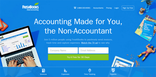
Second, to the header, the copy on the page should provide any information a customer might need in a pithy way. Make sure to clearly elaborate on how your product aims to provide good solutions to customers. Within the copy, include a call-to-action in order to guide the potential customer to doing what you set out to have them do. The copy, including the header, should include keywords for SEO purposes, helping not only the landing page but also the main domain.
Pro tip: It may sound simple, but make sure you’re answering why-who-what. Why a prospect should care (the problem you’re solving). What you’re providing (the solution). Who you are (you’re the person for the job, credentials, testimonials). If you can achieve this in a pithy manner, most of the grunt work is done.
Use a clear and compelling call-to-action
You could say that this is the most important aspect of the landing page. You can put all the work in the world into building the most beautiful and clear-cut landing page ever, but if there is no clear next step for the visitor, your conversions will be abysmal.
The marketer/customer relationship is simple– give a little, get a little. Otherwise, the motivation to create marketing campaigns framed with a landing page would not be there. The main purpose of launching a campaign is, first and foremost, to convert leads. You can’t get these leads without some sort of call-to-action, enticing the visitor to do what you want them to do on the page.
Pro tip: Make your CTA a button on the page. Internet users are habituated to using buttons, so it’s only natural that we do not reinvent the wheel here. When a prospect visits your page, likes your product, and sees a button– they know what to do. The button should be in an attractive color, and above the fold.
Add visual storytelling
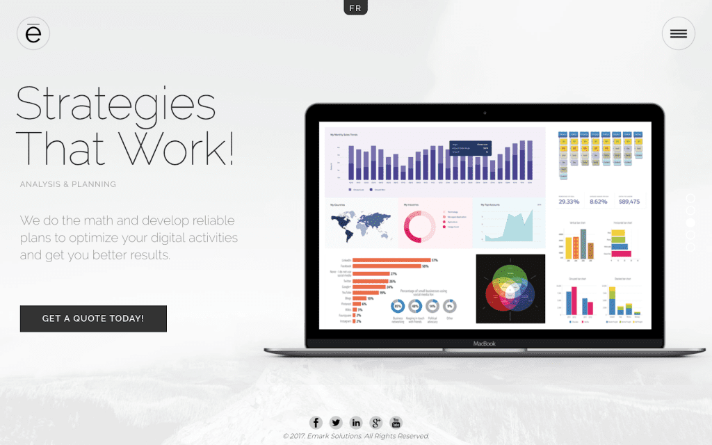
At all times within the marketing funnel, it is important to solidify the brand. This is done partially through copy and keywords, but mostly through visual and aesthetic representations of the company. The landing page graphics must be consistent with the brand, while representing the offer clearly. Consider including explainer or testimonial videos, or photos of customers using the product. Incorporating a video in the landing page can increase your conversion rate by 86%, according to video production company, Eyeview Digital.
Pro tip: While you have to make sure you include everything the page might need, from text, to images, to buttons, and so on, make sure to avoid cluttering the design. Ensure the page visuals are ultimately supporting your message, rather than distracting from it.
Make it mobile responsive
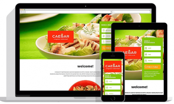
It’s also important to note that mobile responsiveness of the page will significantly impact a potential customer’s experience on your page. You cannot accurately predict how exactly someone will land on your page, especially if you are marketing on many different channels. So ensuring that you are building the page in order to look visually appealing on all devices is absolutely paramount.
Pro tip: Point blank, it will be crucial here to choose a landing page building tool that accounts for mobile responsiveness. Without this, you are losing out on the huge portion of prospects that have accessed the page through different devices.
Let it load quickly
We live in a go-go-go age. We are used to getting what we want when we want it. We’ve been spoiled with advances in computer technology, so for us, when we click on something and it doesn’t load quickly, we get frustrated or click off. In fact, a whopping 77% of internet users have said that they’ve come across a website that takes too long to load.
Page loading time is a significant part of what plays into a website visitor’s experience on the page. With that, it is in your best interest to ensure that your landing pages can load as quickly as possible for the potential customer.
Pro tip: The easiest way to reduce the load time of a page is to remove some of the page’s elements. Everything on your landing page needs to be justified to be there, as things like widgets, images, videos, etc. are the main culprits that cut into the loading time of page. You should also ensure that your images and videos are optimized for web, and that you build the landing page on an uncluttered server with clean code – you might even consider cloud hosting.
The Big Picture
Lastly, it’s important to take a step back and make sure your landing pages fit the larger online landscape you’ve provided to your potential customers. The page should be an extension of your own domain (example: landingpage.example.com, where the main domain is example.com). It should also include social media sharing icons, so people can easily share this page to their family and friends if they see fit.
The landing page can be a beauty, but if it doesn’t feel like the ad someone clicked on, the brand experience falls apart. On the other hand, a landing page that doesn’t properly link to an FAQ, the homepage, or provides contact information, may do more harm than good.
In summary, landing pages need to be designed with the intention of turning them into a jumping-off point for potential customers to perform a particular action. They achieve this by being focused on a singular point, providing additional information for the customer and gathering potential customers information in order to lead convert as seamlessly as possible. The bottom line is that landing pages are a key tool in maximizing your conversion rate.
Don’t forget to share this article
